The Psychology Behind Color Choices in Visual Communication
In the world of visual communication, color is more than just a decorative element—it’s a powerful tool that can influence emotions, perceptions, and even behaviors. Whether you’re designing a logo, creating an ad, or selecting a color scheme for a website, understanding the psychology behind color choices can help you craft more effective and impactful visuals. In this article, we’ll explore how different colors affect our emotions and decision-making processes, providing you with practical insights for using color strategically in your designs.
Why Colors Matter in Visual Communication
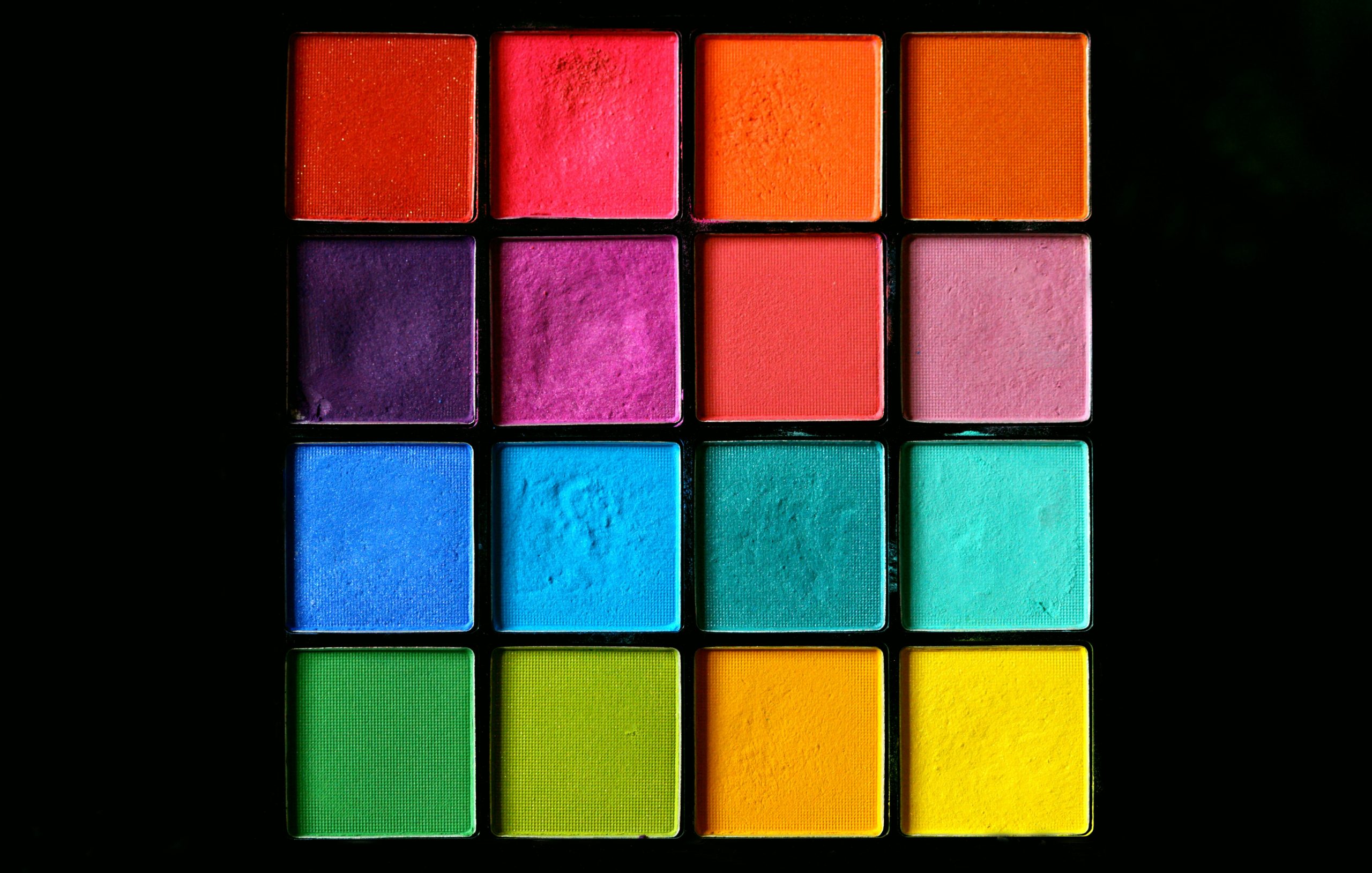
Colors are universally understood symbols that evoke emotional responses. From the warm tones of red to the coolness of blue, each color can trigger a specific psychological reaction. Understanding these reactions is crucial for designers, marketers, and communicators because colors have the ability to influence consumer behavior and perceptions of a brand.
Free printable poster templates can be a great tool for experimenting with color schemes. By selecting the right colors for your posters, you can not only catch attention but also convey the right message and emotion. So, let’s dive into how different colors impact our emotions and decision-making processes.
The Emotional Impact of Color
Red: Energy, Passion, and Urgency
Red is one of the most powerful colors in the spectrum. It’s associated with excitement, passion, and urgency. This color can trigger a fight-or-flight response, making it a great choice for calls-to-action, urgent messages, or advertisements that aim to grab attention quickly. Red is often used in sales, clearance signs, and time-limited offers because it creates a sense of urgency.
However, red can also evoke feelings of aggression or danger if overused, so it’s important to balance it with other colors to avoid overwhelming your audience.
Blue: Trust, Calm, and Professionalism
Blue is the color of trust and professionalism. It’s commonly used by corporate brands, financial institutions, and healthcare organizations. Blue has a calming effect, evoking feelings of tranquility and security. This makes it a great choice for businesses that want to communicate reliability, competence, and stability.
Additionally, blue is often used in social media platforms like Facebook and LinkedIn, where trust and connection are key. If you want your design to exude professionalism and dependability, blue should be a primary color in your palette.
Yellow: Optimism, Attention, and Creativity
Yellow is often associated with optimism, happiness, and creativity. It’s a bright, attention-grabbing color that can evoke feelings of warmth and positivity. However, too much yellow can cause anxiety, so it’s best used in moderation to highlight important elements or add a cheerful touch to your design.
Yellow is commonly used in advertisements for food and leisure products, as it stimulates the appetite and evokes feelings of warmth and happiness.
Green: Growth, Health, and Nature
Green is the color of nature, growth, and renewal. It’s often associated with health, well-being, and environmental consciousness. Green is a soothing color that can promote relaxation and a sense of calm. It’s frequently used in the branding of products related to health, sustainability, and wellness.
In addition to its connection to nature, green also symbolizes wealth and success, making it a great choice for brands that want to communicate prosperity and financial growth.
Orange: Creativity, Adventure, and Enthusiasm
Orange is a vibrant, energetic color that symbolizes creativity and adventure. It’s a color that can make a statement without being as intense as red. Orange is often used in advertising and branding for products or services aimed at a younger, more adventurous audience.
Because it combines the energy of red and the optimism of yellow, orange can be used to create a sense of excitement, but like yellow, it should be used in moderation to avoid overwhelming the viewer.
Purple: Luxury, Wisdom, and Royalty
Purple is historically associated with royalty, luxury, and sophistication. It’s a color that conveys elegance, wisdom, and creativity. Purple is often used in luxury brands, high-end products, and artistic endeavors to communicate exclusivity and creativity.
Purple’s calming and spiritual qualities also make it a popular choice in wellness and beauty brands, where it symbolizes relaxation and self-care.
Black: Sophistication, Authority, and Mystery
Black is a versatile and powerful color in visual communication. It conveys sophistication, elegance, and authority. Black is often used in high-end fashion, technology, and luxury goods, where it communicates a sense of exclusivity and mystery.
However, black can also be associated with darkness or negativity, so it’s important to pair it with lighter colors to create balance and avoid evoking feelings of dread.
Practical Tips for Using Color in Visual Communication
- Know Your Audience: Different cultures and demographics can have different associations with color. For example, while red might signify luck and happiness in China, it can symbolize danger in the United States. Always consider the cultural context when selecting colors.
- Use Contrast Wisely: High contrast between colors can grab attention, but too much contrast can create visual fatigue. Strive for a balance that allows for easy readability and visual appeal.
- Limit Your Color Palette: Using too many colors can make your design look chaotic and unprofessional. Stick to a primary color with one or two accent colors for a more cohesive and focused design.
- Test Your Colors: Use tools like free printable poster templates to test different color combinations before finalizing your design. This allows you to see how the colors interact and make adjustments if needed.
Conclusion
Color is a fundamental element of visual communication, influencing how we perceive messages and connect with brands. By understanding the psychology behind different colors, you can make more informed decisions in your design process, creating visuals that resonate with your audience on a deeper level. Remember to consider the emotional impact of color, test your designs, and always keep your target audience in mind for the best results.